Aptura Redesign
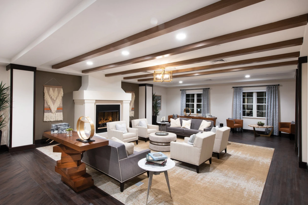
Aptura is an award-winning Senior Living design, construction, planning and procurement firm. However, their website was outdated and no longer accurately represented who they are nor their unique value. We set out to change that by designing a modern, immersive web experience that showcases Aptura’s expertise and innovation.
Project Details

My Role
As the project lead, I was responsible for overseeing design, development, and UX as well as the overall quality of work produced by the creative team. I also facilitated a project discovery session and assumed the presenter role when sharing project milestone updates with senior leadership.

Collaboration Partners
Julia & Calie – Marketing Strategists
Britt – Project Manager
Mike – Web Designer
Derek – Web Developer
Alexa – Copywriter
Kristal – Sr. Graphic Designer
Adam – UX Designer

Tech Stack
We built the site in WordPress on the Divi theme, and ensured it will be easy to maintain. The dynamic nature of the content relied heavily on the use of the Advanced Custom Fields and Search & Filter Pro plugins. We also used the Google Maps API to develop a custom, interactive portfolio map.
The Discovery Session
I’m a big believer in investing ample time at the beginning of a project to create a strong understanding of three primary things:
- Who is our target audience and what are their needs?
- What business objectives are we trying to achieve?
- What information can we glean to help us design an effective solution?
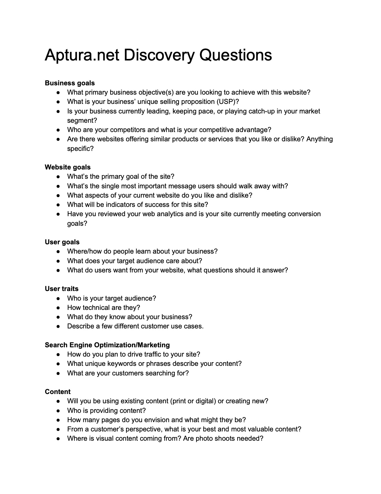
One way to gain A LOT of ground quickly is to ask the right people the right questions. In this case, that meant sitting down the Aptura’s senior leadership team for a couple hours to talk through what they perceive to be their biggest problems as well as their hopes and dreams for a new website. The answers they provided proved critical and set us on a path to success.
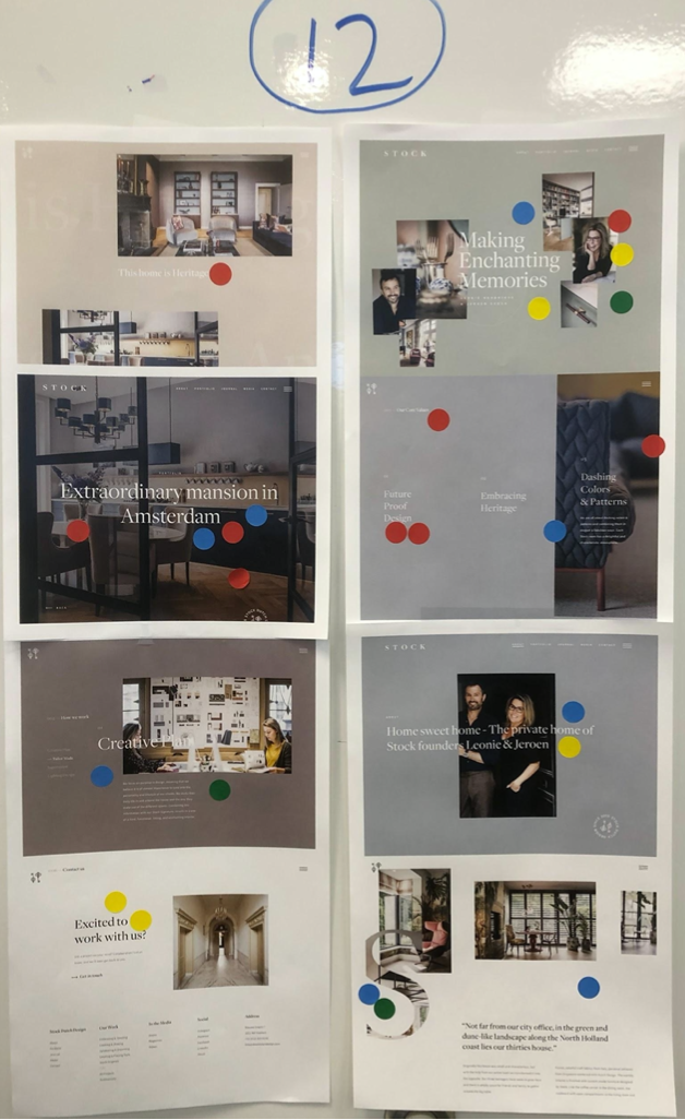
I also designed a “gallery walk” of sorts by printing off and hanging up a blend of about 25 competitive and aspirational site design examples.
The Aptura senior leaders and our creative team were then given sheets of sticker dots, so they could mark things they liked (messaging, colors, layout, typography, photography, etc.) from the examples provided. After everyone finished, we then walked through each example together as a team and discussed everyone’s opinions and how certain styles might be applicable to our project.
Finally, we sat down and had each person in the meeting share their top three must-have takeaways from the discovery session. Here’s a sampling of their responses:
- “Immersive photography that you want to step into”
- “Elegant interface that’s easy to use”
- “Minimalist design with breathable content”
- “Keep the copy brief, but say the right things powerfully”
- “A little whimsy”
- “Create avenues for fresh content”
- “Approachable look and feel”
Having this type of input before we’ve designed a single pixel of the site is extremely valuable and dramatically reduced revisions later in the process.
The Project Brief
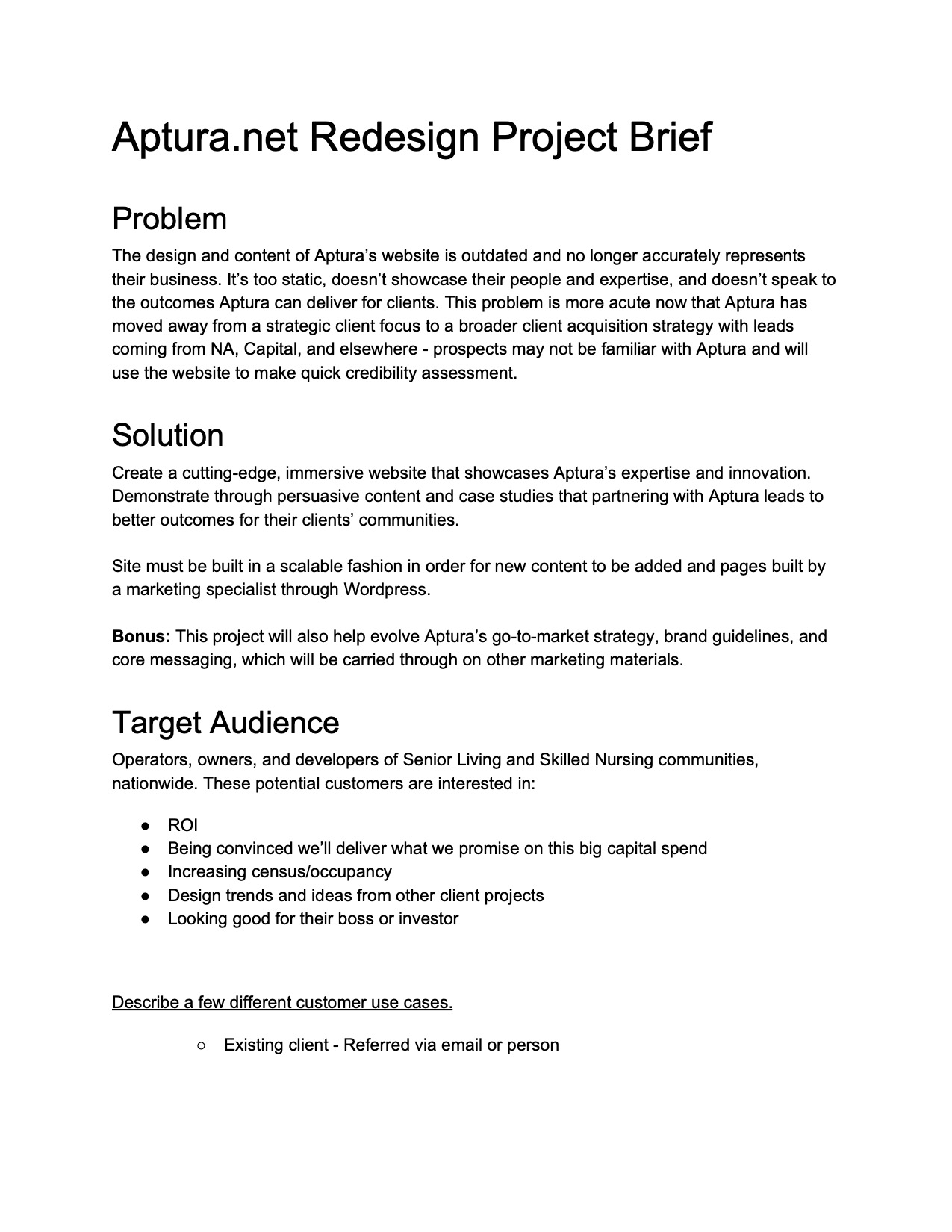
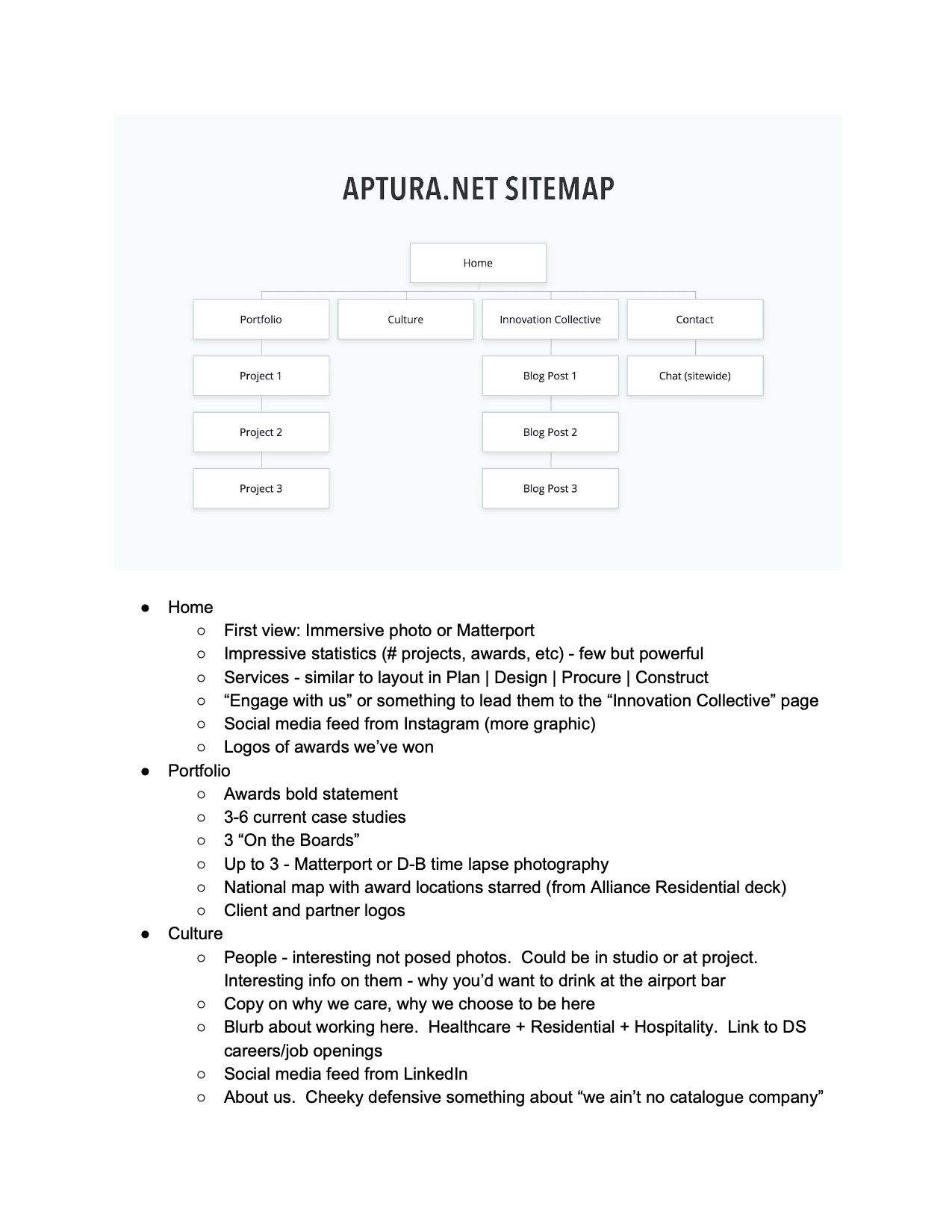
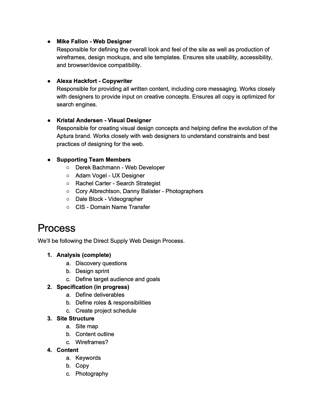
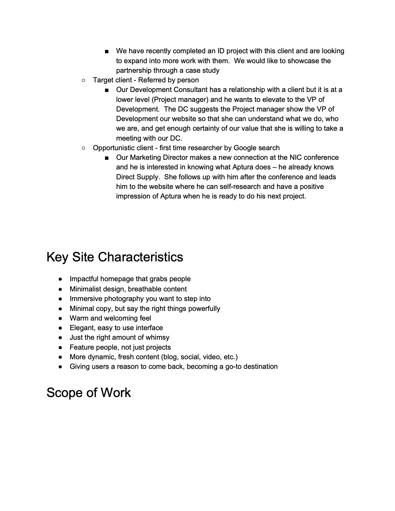
Before diving into wireframes or mock-ups, I distilled all the direction and information we had collected into a six-page project brief. This would clearly document a number of important elements of the project, including:
- The problem
- Our proposed solution
- Our target audience
- Key site characteristics
- An initial sitemap
- Roles & responsibilities
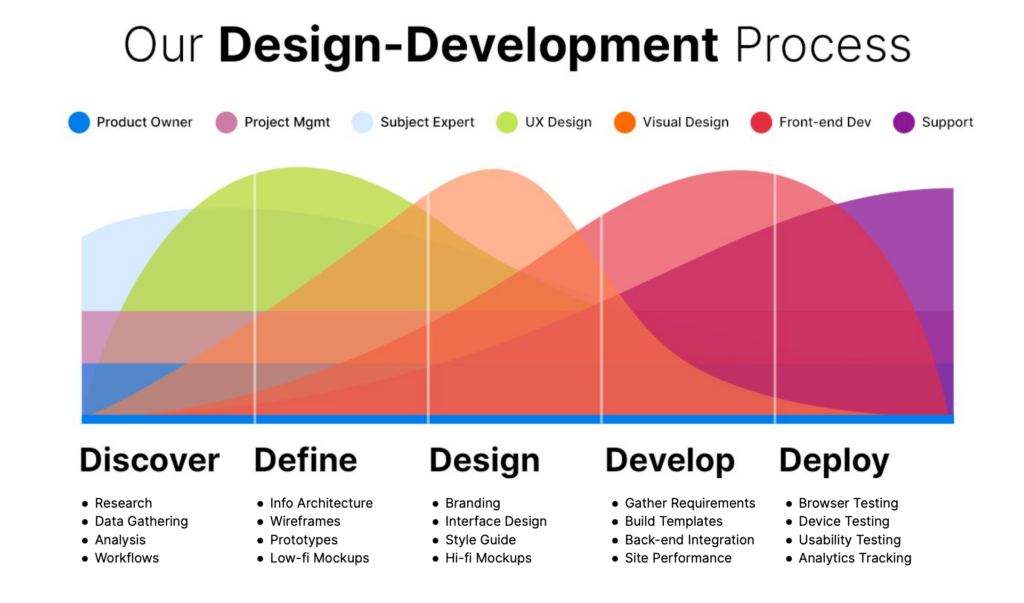
- Our process
- Timeline & risk factors
The brief was primarily intended to achieve two things:
- To echo back everything we were hearing to our project requestors, so they could confirm or adjust the direction we were headed.
- To serve as our North Star throughout the rest of the project. Any time we were faced with a particular design decision, we’d have this document to help ensure we were making decisions in the best interests of our customers and the business.
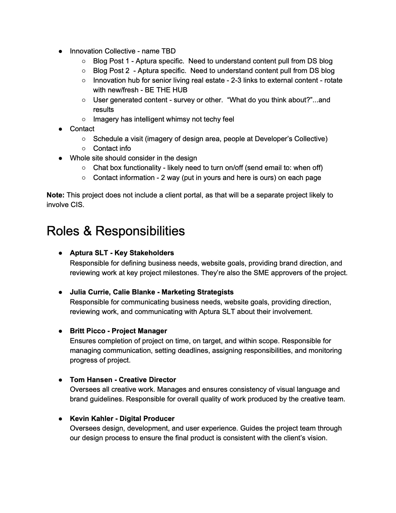
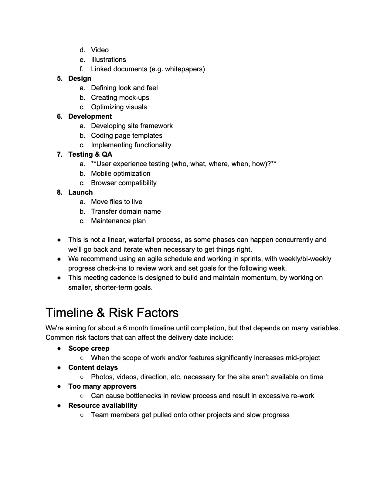
Our Strategy
As we examined the old site, we noticed two major flaws.
The first was that the existing “Services” section of the old site was only a single page, meaning we were trying to sell all our services in the same place. Not only is this a less than ideal user experience, but it’s terrible for SEO.
To fix this, we expanded the services section (now called “Expertise”) into ten separate pages, which would give us ample room to explain each service in greater detail and result in higher search engine rankings.
We color coded these pages into three groupings (green, yellow, and red) to indicate their priority. Being that interior design, design-build, and market intelligence were the most important pages, we would flesh these out first and build them in phase one.


The second major flaw of the old site was the the content was very siloed. If you wanted to see Aptura’s projects, you’d have to go to the portfolio. If you wanted to read news updates, you’d have to go to the blog section. But there was no way to consume multiple types of related content on one page.
Rather than continue thinking about content strictly by section or page, we looked at it simply by content type. We determined that our content would come in three forms: projects, people, and posts, and that it could cross-pollinated together anywhere, thus making it accessible in multiple ways.
For example, a user could now land on the interior design page and see related portfolio samples, people, and blog posts dynamically populated together on a single page.
Cool Features
Dynamic Featured Projects
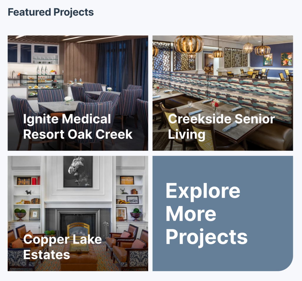
An important aspect of the new site is that it’s very easy for non-technical content managers to maintain. One example of this is the dynamic “featured projects” section on the homepage. In the WordPress admin, a content editor can easily add a new portfolio project and mark it as featured with a simple checkbox, which will automatically showcase the project on the homepage and at the top of the “Portfolio” page.
Custom Portfolio Filtering
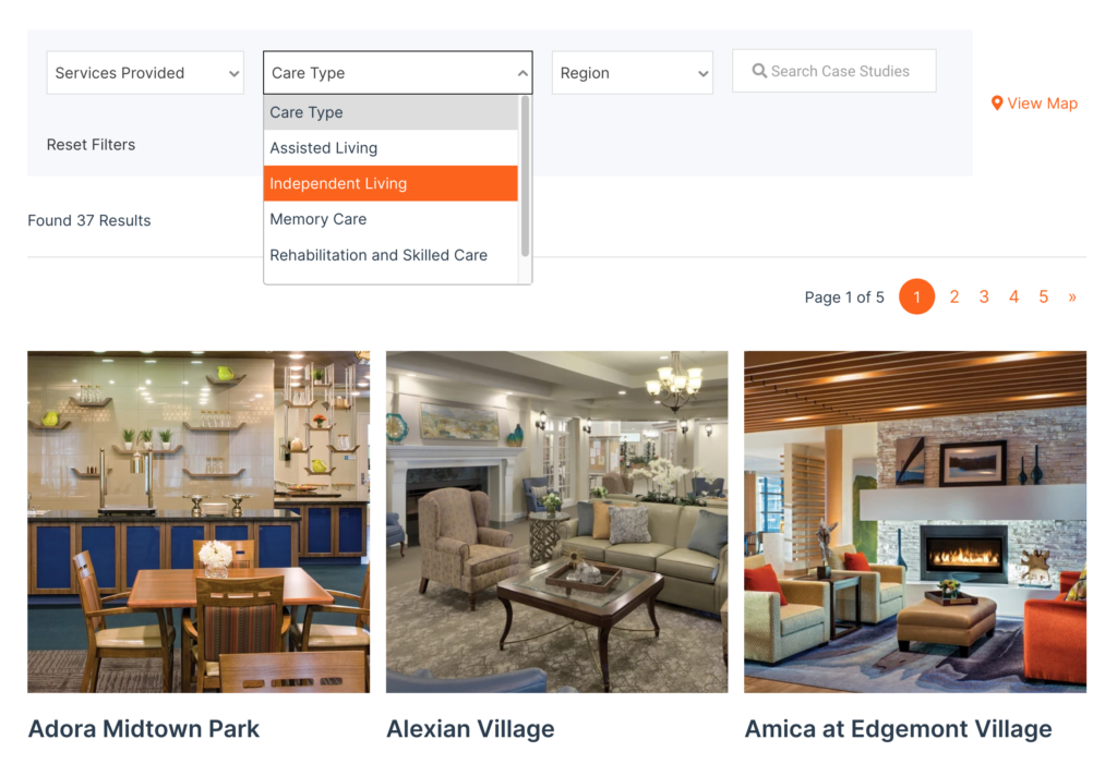
We made great use of the Advanced Custom Fields and Search & Filter Pro plugins to make it super easy for users to quickly narrow in on the types of portfolio projects they’re looking for. Whether filtering by services provided, care type, region or any combination of those, finding a project similar to your own is now a breeze.
Interactive Map
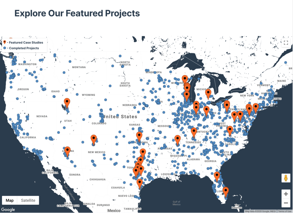
Aptura has completed more design and construction projects than any other company in Senior Living, and they wanted a way to represent that visually. To achieve this, we built a custom, interactive map using the Google Maps API that dynamically pulls in all their projects and allows users to scan, zoom, and find portfolio samples from all over the United States.
Sticky Project Subnav
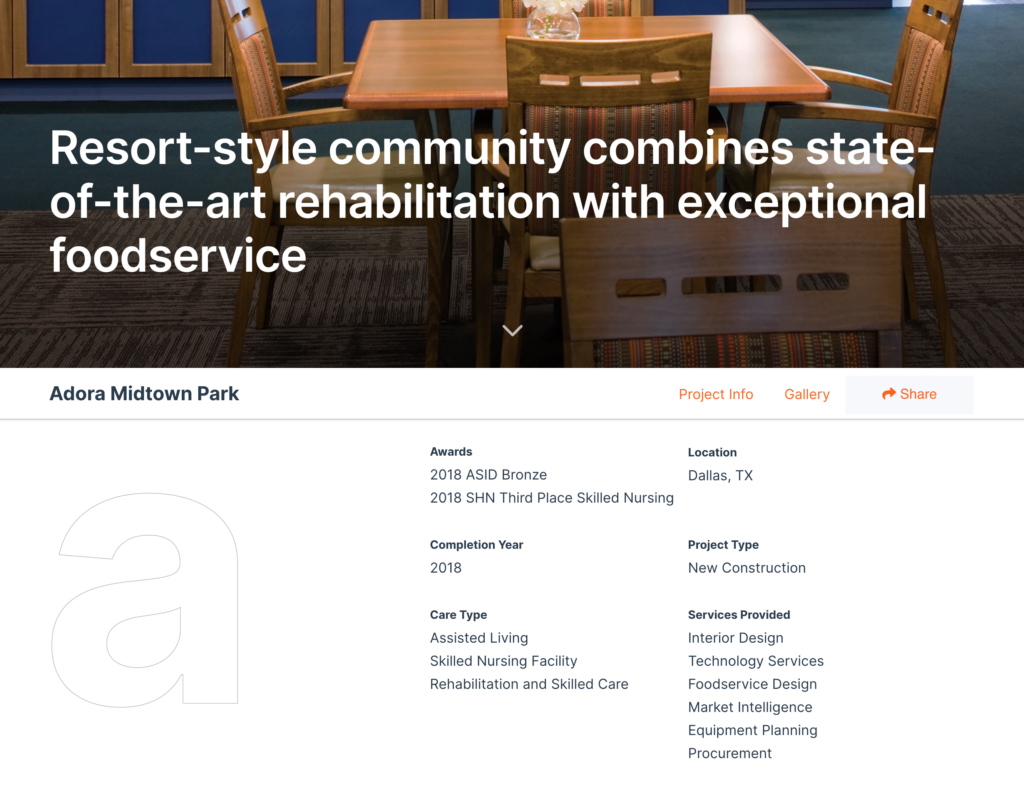
We added a “sticky” subnavigation bar to each portfolio project page, so the name of the project and anchor links for navigating the page stay with you at all times. There’s also a cool, animated share feature that allows users to share the page on their choice of four social platforms or email it to a colleague. This was key, as a lot of Aptura’s opportunities arrive via word of mouth.
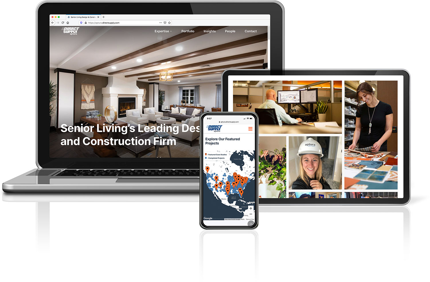
The Final Result
After testing the site with customers and running it through a battery of browser and device testing (thanks, BrowserStack), we took the new Aptura web presence live on schedule. The feedback we received internally and externally was overwhelmingly positive, and people love the modern look and feel of the site as well as its “clickability” given all the new content we blended together.